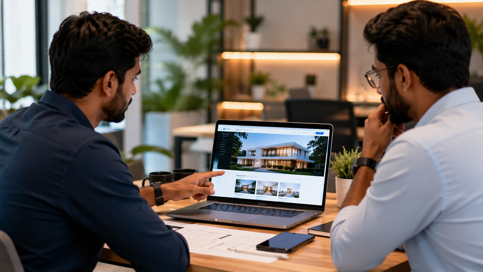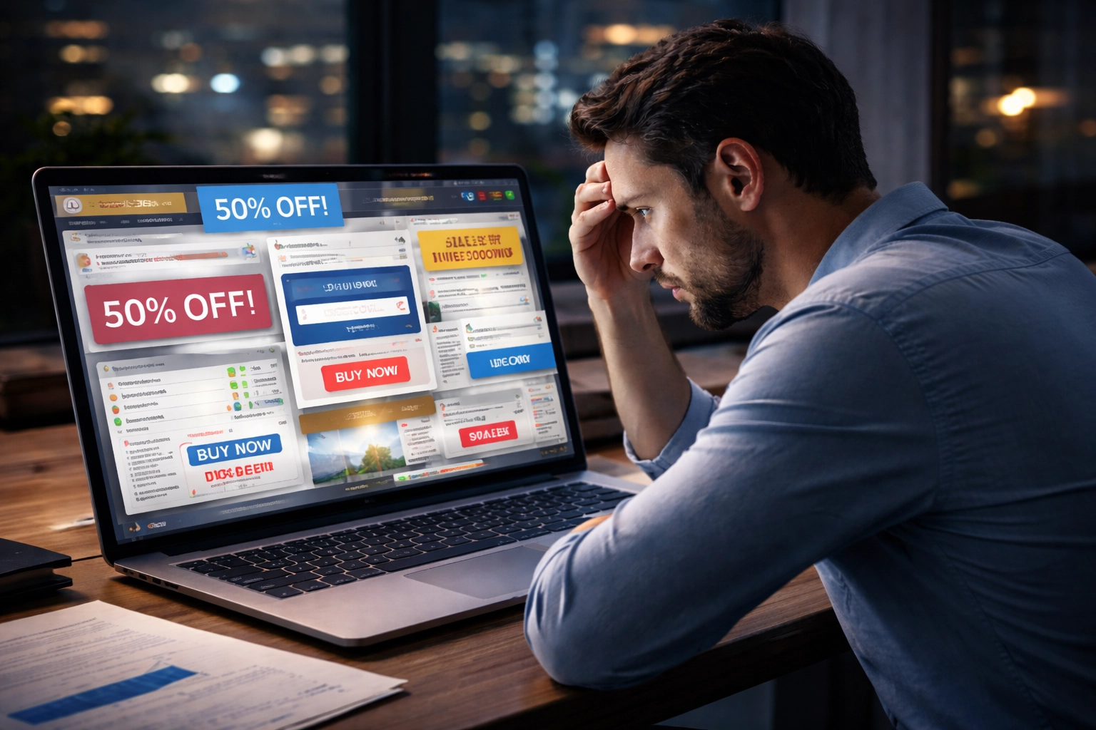
When planning a modern business website, there is often a temptation to make it visually impressive.
Parallax scrolling. Smooth transitions. Moving backgrounds. Text animations. Image reveals. Hover effects.
These can certainly make a website look impressive.
But there is another approach:
A clean, well-structured website with subtle and purposeful animation.
So which one is better?
The answer isn’t simply “animated” or “minimal”. Both approaches have their place. The important thing is understanding when each approach is useful and what it does for the visitor.
What Does Animation Actually Add to a Website?
Animation can do more than make a website look attractive.
Used properly, it can:
- Guide attention towards important content
- Show how a product or service works
- Create a sense of depth
- Make interactions feel more natural
- Help tell a visual story
- Make a brand feel more distinctive
For example, a product website might use scrolling animation to demonstrate how a product works. An architecture website could use transitions to present projects. A creative agency could use motion to demonstrate its design capabilities.
In these situations, animation has a clear purpose.
It contributes to the experience rather than simply decorating the page.
When Parallax and Heavy Animation Work Well
Animation-heavy websites can be particularly effective when the visual experience is an important part of the brand.
They can work well for:
- Creative agencies
- Portfolio websites
- Luxury brands
- Architecture and interior design
- Product launches
- Campaign websites
- Interactive storytelling
For these types of websites, the visitor may actually expect a more immersive experience.
A carefully designed parallax effect or transition can make the website memorable.
But More Animation Doesn’t Always Mean Better
Now imagine a website where almost everything moves.
- Text slides in from different directions.
- Images constantly zoom.
- Backgrounds move while scrolling.
- Multiple parallax layers run simultaneously.
- Every section has a different transition.
- Buttons have exaggerated hover effects.
It might look impressive when you first see it.
But when you actually want to read something, find a service or contact the business, all that movement can become distracting.
A website should not make it harder to use just to make it more visually impressive.
Why a Well-Structured Website Can Be More Effective
For many business websites, visitors are looking for information rather than an immersive visual experience.
They usually want to understand:
- What does this business do?
- What products or services does it offer?
- Why should I trust the business?
- What experience do they have?
- How can I contact them?
In these situations, a clear layout can be more useful than heavy animation.
A typical service business might have a structure such as:
Hero → Services → About → Projects → Testimonials → FAQ → Contact
The visitor can move through the information naturally.
The website can still feel modern through good typography, spacing, imagery, colour, subtle transitions and carefully designed interactions.
Minimal Doesn’t Mean Boring
Minimal design is sometimes misunderstood as a website with very little visual design.
That’s not what minimal UI means.
A minimal website can still have:
- Strong typography
- High-quality imagery
- Modern layouts
- Micro-interactions
- Subtle scroll animations
- Hover effects
- Smooth transitions
- Carefully designed visual hierarchy
The difference is that these elements don’t compete with the information.
The design supports the content instead of becoming the content.
Animation vs Minimal Design: A Simple Comparison
| Animation-Heavy Website | Minimal, Structured Website |
|---|---|
| Focuses strongly on visual experience | Focuses strongly on clarity and information |
| Can create an immersive experience | Can make information easier to scan |
| Useful for creative and visual brands | Useful for many service and business websites |
| Can make a website more memorable | Can make navigation more straightforward |
| May require more development work | Can be simpler to maintain |
| Heavy effects can affect performance | Generally easier to keep lightweight |
Neither side is automatically better.
The right choice depends on what the website needs to accomplish.
What About Website Performance?
This is another reason to think carefully about animation.
Large videos, complex scroll effects, multiple animations and heavy visual assets can increase the amount of work required from the browser.
This can become more noticeable on mobile devices or slower connections.
That doesn’t mean animation should always be avoided.
It means performance should be considered when deciding how much animation to use.
A visually impressive website still needs to be responsive and reasonably fast.
Mobile Changes the Equation
An animation that looks great on a large desktop screen may not provide the same experience on a mobile phone.
On smaller screens, there is less space and users are often interacting through touch rather than a mouse.
Some effects may need to be simplified, reduced or removed entirely.
A good responsive website doesn’t simply make the desktop version smaller.
The experience should be adapted to the device.
Should Every Section Have Animation?
No.
This is probably one of the simplest principles to follow.
If a section communicates its message clearly without animation, there may be no reason to animate it.
Animation can be reserved for places where it actually adds something.
For example:
- A subtle image reveal when entering a section
- A hover effect that indicates an interactive element
- A smooth transition between states
- A product interaction that explains functionality
These small details can make a website feel polished without overwhelming the visitor.
Sometimes the Best Design Is a Combination
It doesn’t have to be a choice between a completely static website and an animation-heavy website.
A business website can combine both approaches.
For example:
Engaging hero animation + clean navigation + structured content + subtle section transitions + simple enquiry process.
This can give the website visual personality while keeping the important information easy to access.
The goal is balance.
How to Decide Which Approach Is Right
Before adding an animation or parallax effect, it is useful to ask:
- Does this help explain something?
- Does it improve the user’s experience?
- Does it support the brand?
- Does it make navigation clearer?
- Will it work properly on mobile?
- Will it affect performance?
- Could the same information be communicated more simply?
If an animation has a clear purpose, it can be valuable.
If it exists only because the page feels empty without it, it may be worth reconsidering.
Different Businesses Need Different Website Experiences
A creative agency may benefit from a highly interactive website.
A luxury fashion brand may use animation to create an emotional visual experience.
An eCommerce website may need to prioritize product discovery, filtering and checkout.
A professional service company may benefit more from clear information, trust signals and simple navigation.
A local business may simply need visitors to quickly find its services, location, opening hours and contact details.
There is no single design style that works perfectly for every business.
The website should be designed around the business, its audience and the way visitors are expected to use it.
So, Which Is Better?
If the purpose of the website is to create an immersive visual experience, carefully planned parallax and animation can be an excellent choice.
If the purpose is to communicate information clearly and help visitors take action, a clean and well-structured interface may be more effective.
And in many cases, the best solution is a combination of both.
The important thing is not whether a website has animation.
It is whether the animation, layout and visual design are helping the visitor.
Final Thought
Parallax is not bad design.
Minimal design is not automatically better.
Animation is simply another design tool.
Used thoughtfully, it can make a website more engaging and memorable. Used excessively, it can make the same website harder to navigate, slower to load and more distracting.
Good website design isn’t about how much you can animate. It’s about knowing what is worth animating.
Ultimately, a good business website should find the right balance between visual appeal, clarity, usability and performance.
Related Guides: